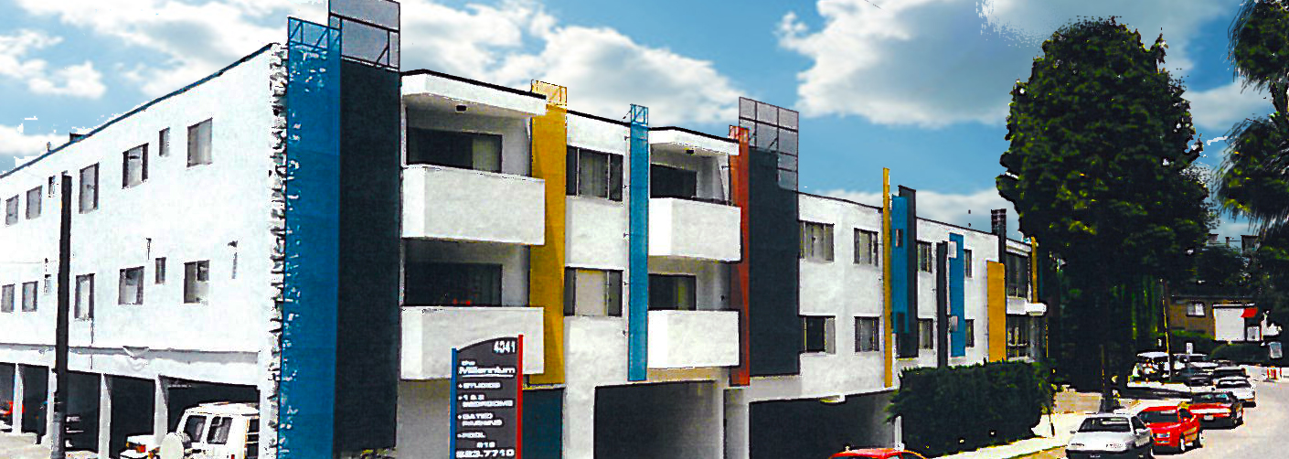
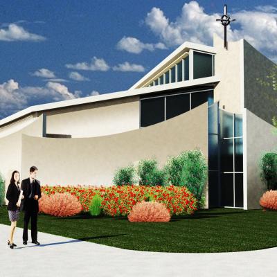
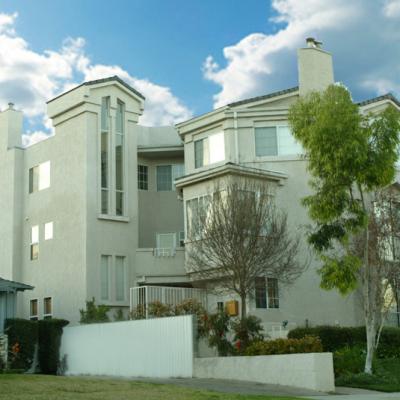
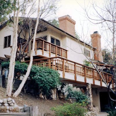
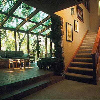
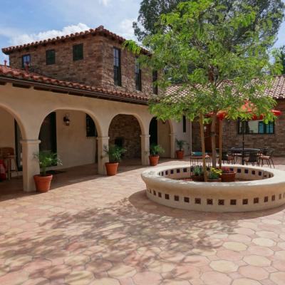
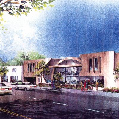
This existing building has a curved front street presence. The original colors, building materials, and landscaping did not accent this project well. We came up with the concept of less is more. By painting the building white we could accent the new screen panels system while off setting each panel over the other along the curved face of the building. The interior court yard doors were painted in the primary color scheme. The low budget remodel increased the buildings value substantially almost immediately.

